A free virtual hair color try-on is useful when it slows the decision down. It can show whether copper feels too loud near your skin, whether cool brown drains your face, or whether a darker root makes a blonde idea look more believable. The problem is that a preview can also flatter the shade in ways real hair will not. A cleaner test starts with a plain photo, steady lighting, and a little suspicion.
Set up a neutral free test before judging the shade
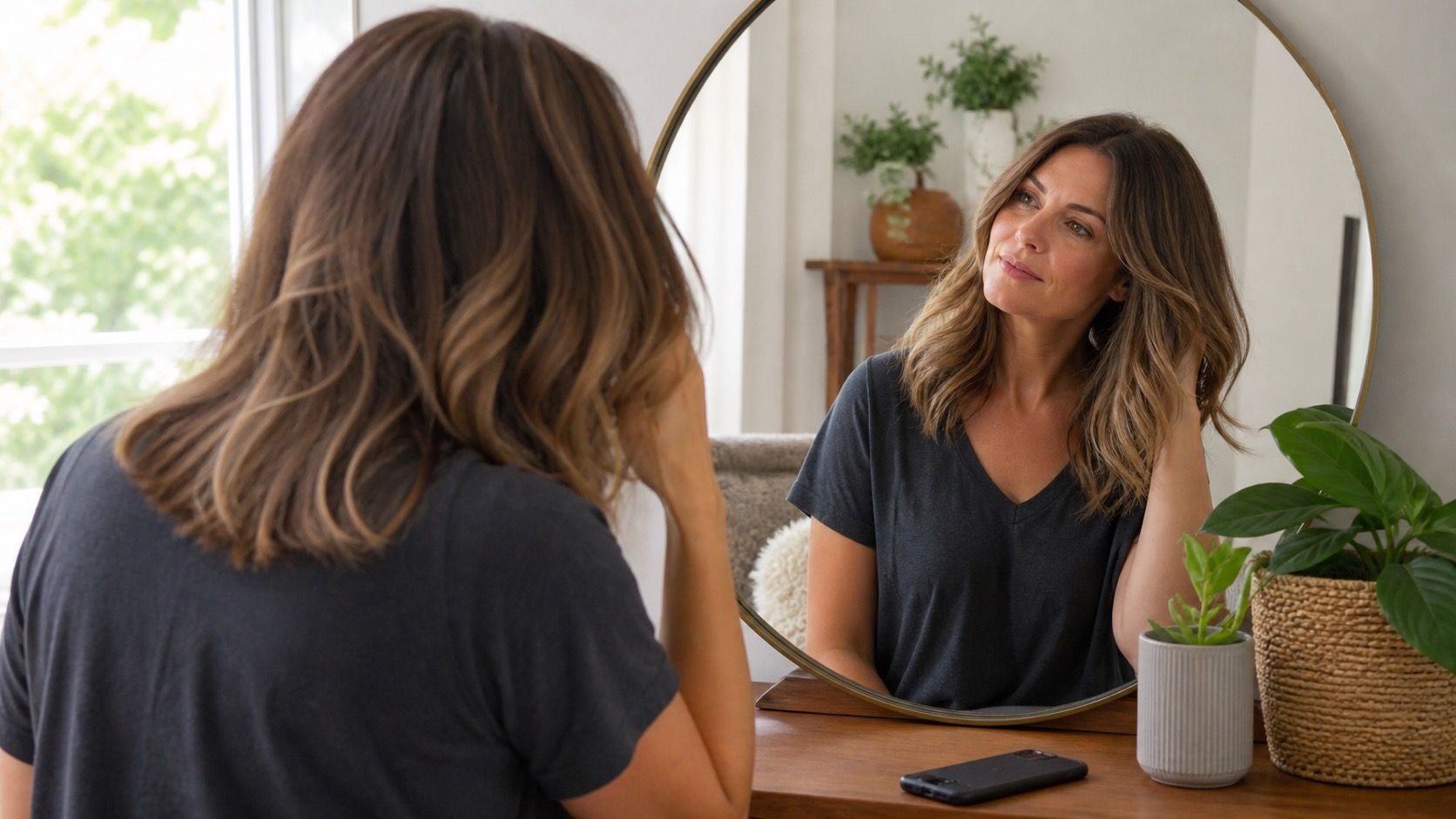
Start with the most boring photo you can tolerate. Stand near a window in natural daylight, face the camera straight on, and keep the phone close enough that the hairline and roots are visible. A bathroom mirror shot under warm bulbs can make brunette look golden and blonde look softer than it is. A backlit selfie can turn every shade muddy. The tool may still work, but you will be judging the light as much as the color.
Use unstyled hair if you can. Fresh waves, heavy shine spray, and strong smoothing filters make the preview look expensive before the color has done anything. Pull the hair away from scarves, dark collars, and busy wallpaper so the hair mask has a simpler edge to follow. If the tool asks for a live camera, take a still screenshot after the preview and compare it with a still before photo. Moving images are easy to forgive; still images are less polite.
A quick privacy check belongs at this stage, especially with free tools. Free does not automatically mean private, temporary, or local to your device. Look for basic data settings before uploading a face photo. If the terms are unclear or the app wants more access than the preview needs, use a less identifying photo or skip that tool. The color decision is not worth handing over a full gallery by habit.
Why the first preview often looks too smooth
Most free previews work by placing a digital color layer over the hair area. If the hair mask is generous, it may color the forehead, ears, glasses, or background wisps. If the mask is too tight, it leaves pale roots and untouched pieces around the face. Neither mistake means the shade is bad, but both make the result less useful. The preview is showing a simplified surface, not thousands of strands with different porosity and reflection.
The smoothness is most obvious with red, vivid, and very dark shades. A burgundy overlay can look glossy on screen because it ignores old highlights and uneven ends. A black overlay can make the hair look dense and graphic, while real dark dye may emphasize a hard regrowth line after a few weeks. Cool ash shades can look clean in a preview, then feel flat in a room with warm indoor light. Treat the first result as a sketch, not a promise.
There is also the display problem. A phone set to vivid color mode can make auburn richer and beige blonde creamier than another screen will. Night shift settings can warm everything. Before you decide that a shade is perfect, switch off display warmth, turn the brightness to a normal level, and look again. It is a small check, but it catches a surprising number of almost-right choices.
Compare three shades in the same photo
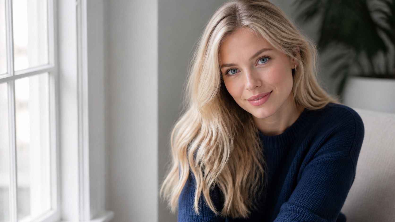
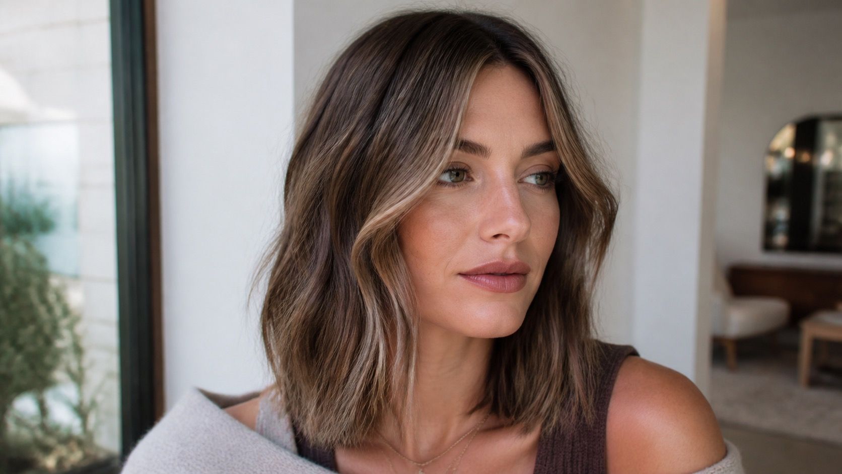
The cleanest way to use a virtual hair color try on is to compare a narrow set of options in one photo. Pick three shades that answer a real question: soft copper, neutral brown, and cool brown; or dark blonde, beige blonde, and light brown. Do not jump from platinum to blue-black to cherry red unless that is truly the decision. Big jumps are fun, but they teach less about what will flatter your face day to day.
Keep the same photo, same zoom, and same intensity setting for every shade. If one preview uses a stronger opacity than another, the comparison becomes unfair. Save each version with a simple name, then place them side by side. The shade that wins in isolation is not always the one that looks most believable next to your skin, brows, and usual clothing colors.
| Preview check | What to look for | Why it matters |
|---|---|---|
| Warmth | Does the shade make skin look clearer or more yellow? | Color temperature changes how the face reads before anyone notices the hair itself. |
| Depth | Does the new color overpower brows or eye contrast? | A shade can be pretty but too heavy for your natural contrast. |
| Edge | Are roots, part line, and hairline believable? | Bad edges can hide the upkeep problem. |
| Texture | Do waves, curls, or fine ends still show? | Flat overlays can make damaged or fine hair look smoother than it will be. |
Check roots, hairline, and texture before trusting it
Zoom in on the areas a salon mirror will not hide: the part, temples, baby hairs, and the first inch at the roots. A free virtual hair color try-on may paint the lengths well and fail exactly where regrowth and skin tone meet. If the chosen color looks good only because the root is blurred, that is a warning. Ask whether you would still like the shade with your natural root showing after four to six weeks.
Texture needs the same attention. Curly hair catches light in broken ribbons, while a straight overlay can make it look like one solid block. Fine hair can look fuller when a tool darkens it evenly. Highlighted hair may lose the variation that makes the color wearable. If your hair has multiple tones now, look for a preview that keeps some dimension. If the tool turns everything into one flat sheet, use it only to judge general warmth and depth.
Do one awkward check: cover the hair with your hand and look at the face first, then uncover the preview. If the color steals attention before the face looks awake, it may be too strong for the look you want. If the face looks clearer and the hair feels like it belongs, save that version. This is subjective, but it is closer to how people will actually see the change.
Decide what deserves a real-world strand test
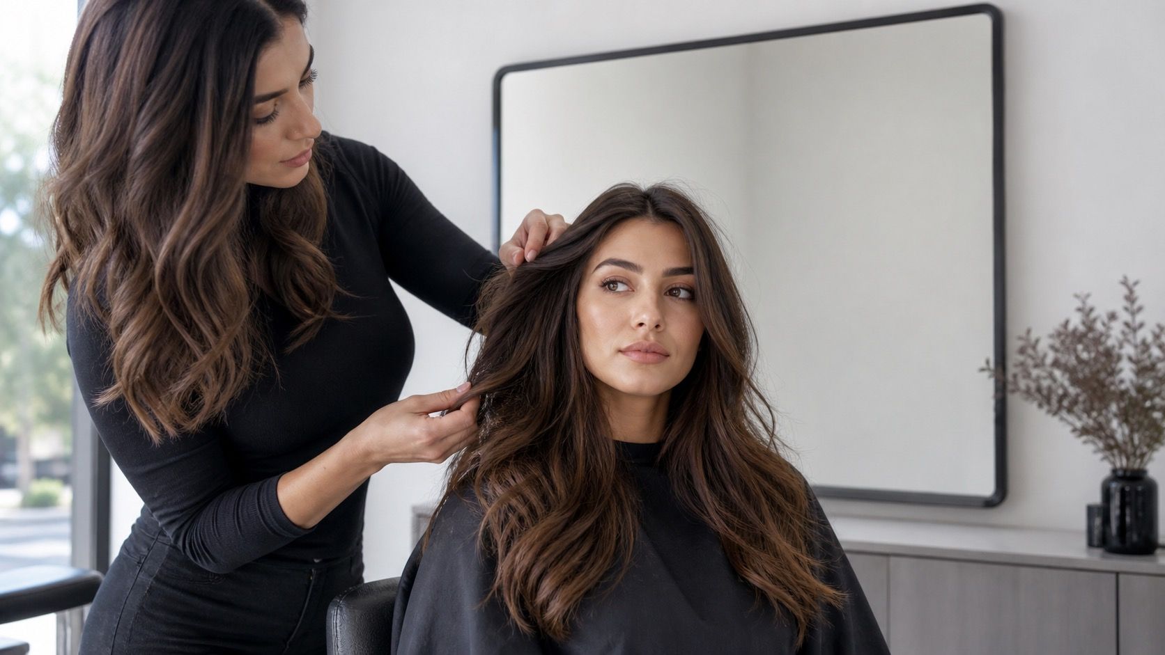
A screen preview cannot tell you how your existing color will lift, how old dye will react, or whether porous ends will grab more pigment. It can help you narrow the conversation. Bring the saved reference to a colorist and say what you liked about it: the soft copper around the face, the neutral brunette depth, or the lower contrast with your brows. That is more useful than asking for an exact match to a digital overlay.
For small shifts, the preview may be enough to choose a direction. A half-step warmer brunette or a slightly deeper gloss is often about mood and maintenance. For major lightening, vivid color, heavy correction, or covering previous box dye, treat the preview as a mood board. A strand test or professional consultation matters because real hair has history. The app sees pixels; a colorist sees banding, porosity, warmth, and what the hair can tolerate.
The best outcome from a free test is not certainty. It is a shorter list of better questions: how warm can the shade go before it clashes, how dark can it go before it feels severe, and where will the roots land in a month. If a free preview helps you ask those questions calmly, it has done its job.