The best virtual hair color try-on is not the one with the flashiest shade grid or the most dramatic selfie transformation. It is the one that helps you make a calmer choice before dye, gloss, toner, or a salon visit. A useful preview keeps the hair edge honest, lets you adjust intensity, shows roots clearly, and gives you a saveable image that still looks believable after the novelty wears off.
Define what best means for your decision
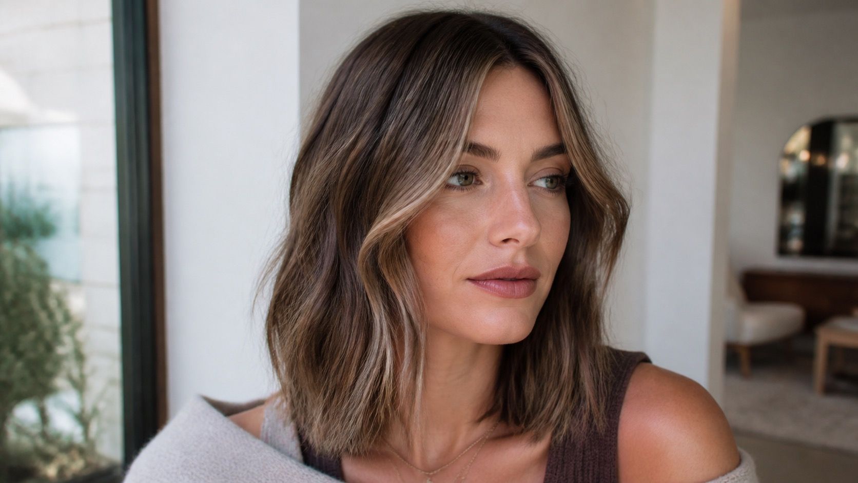
Best depends on the change you are considering. If you want to see whether warm chestnut suits your face better than cool espresso, you need a tool with believable brown and brunette options. If you are testing copper, rose, or blue-black, you need intensity controls because the first preview is often too saturated. If you are planning highlights, balayage, or a shadow root, a simple full-head overlay may be too blunt.
Before comparing tools, write down the decision in plain language. Are you choosing between two salon references, checking whether your brows can handle darker hair, or testing if blonde will fight your skin undertone? That small step keeps the search practical. Otherwise it is easy to spend half an hour tapping through fantasy colors and learn nothing about the appointment you are actually booking.
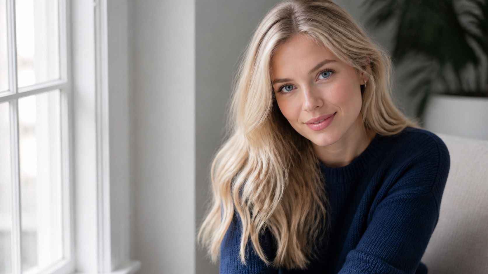
A good virtual hair color try on should also respect ordinary photos. Many people will not upload studio lighting, fresh makeup, or a professional blowout. The useful test is a clear face photo near a window, hair down or loosely pulled back, with no beauty filter. If a tool only looks good on a perfect model image, it may not help much with your own hair.
Hair masking is more important than glossy effects
Hair segmentation decides whether the preview colors hair or colors everything near the hair. Look closely at the forehead, ears, neckline, glasses, and loose pieces around the face. A weak mask may paint skin at the temples or skip fine baby hairs. A too-smooth mask may erase flyaways and make the result look neater than real color will. Glossy effects can hide those errors for a second, but the edges tell the truth.
Texture is another test. Straight hair, curls, waves, bangs, and layered ends all catch light differently. If the tool turns curls into one flat color block, it may still show general warmth, but it will not show dimension. If it keeps some shadow and highlight inside the hair shape, the preview has more value. Fine hair needs extra caution because dark overlays can make it look thicker, while very pale overlays can make ends disappear.
The mask should handle both the main hair mass and the annoying details: a center part, short fringe, grown-out roots, hair tucked behind one ear. Those details are where maintenance shows up later. A preview that ignores roots may make a high-maintenance blonde look easier than it is. A preview that colors the scalp can make dark shades look harsher than they would in real life.
Look for controls that reveal shade intensity
Shade controls matter more than a huge shade library. A library with fifty names is not helpful if every blonde looks like the same yellow filter. Look for warmth, depth, and intensity adjustments, or at least several neighboring shades that can be compared in the same photo. The best virtual hair color try on for a salon decision lets you move from soft to strong without changing the photo or face lighting.
Intensity control is especially useful for reds, coppers, vivids, and cool ash shades. A copper preview at full strength can look exciting on screen and too loud beside everyday clothes. An ash brunette can look clean in the app and dull in warm indoor lighting. When you can lower the effect, you see whether the direction still works after the drama is reduced. That is often closer to wearable color.
| Feature | Useful sign | Weak sign |
|---|---|---|
| Mask accuracy | Hairline, part, and loose strands stay believable. | Skin, background, or glasses get colored. |
| Shade controls | Warmth, depth, or opacity can be adjusted. | Only preset colors with no fine control. |
| Root handling | Natural root or shadow can remain visible. | The overlay hides the maintenance problem. |
| Export quality | Saved image looks clear enough to compare later. | Watermarks, compression, or crop make it hard to review. |
| Data settings | Photo permissions and deletion choices are easy to find. | The upload flow is vague about storage or reuse. |
Check how the tool handles roots and loose hair
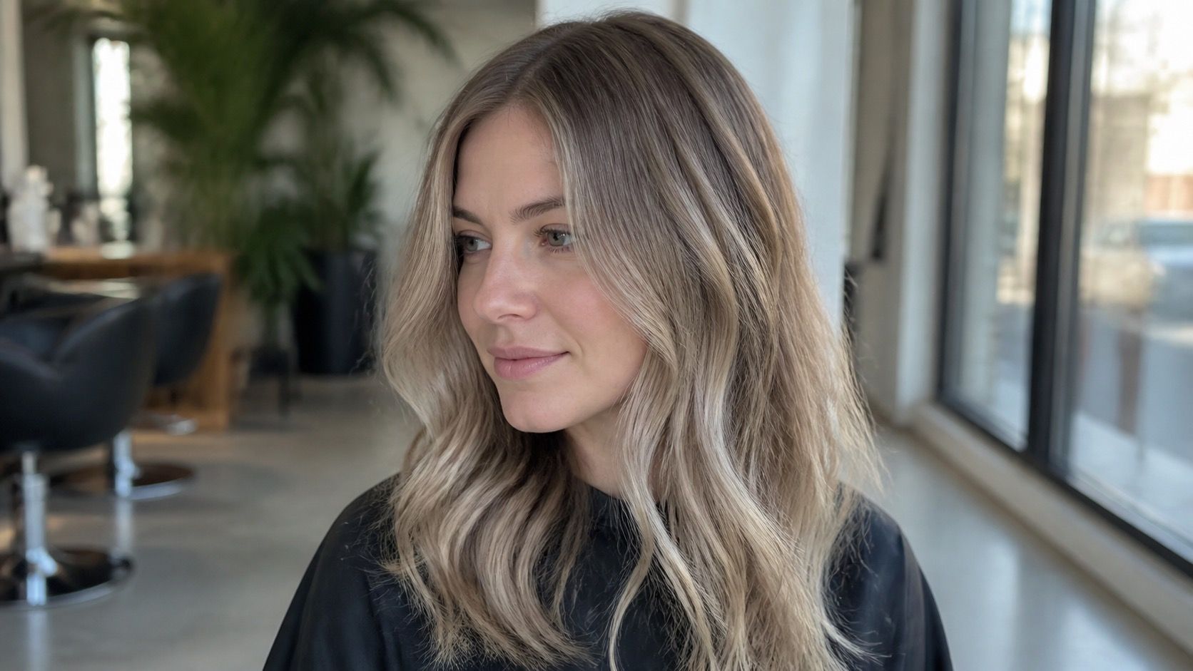
Roots are where a preview becomes useful or misleading. If you have dark roots and want blonde, a tool that paints one even pale shade from scalp to ends is giving you a fantasy version. Real lightening has limits, warmth, cost, and upkeep. If you want to go darker, the root area tells you whether the shade sits naturally near your skin or creates a hard frame around the face.
Loose hair matters because real hair is not a helmet. Bangs, face-framing layers, and soft pieces near the jaw can make a color flattering even when the full-head version looks too heavy. A good preview keeps enough of those details to judge the outline. If every strand is swallowed into a single shape, use the result for broad direction only: warmer, cooler, lighter, darker.
Try a second photo before choosing. Use the same lighting but change the angle slightly, or wear the color of top you often wear. If a shade looks good only in one flattering selfie, it may be fragile. If it looks reasonable in two ordinary photos, the idea is stronger. That second image also catches device display problems, because the first photo may have had a color cast you did not notice.
Use privacy and export settings as part of the comparison
Photo privacy is part of the product, not a separate technical footnote. Hair color previews usually involve a clear face image. Before uploading, check whether the tool explains storage, deletion, account requirements, and gallery access. Free tools can be perfectly usable, but free does not tell you how the photo is handled. If the data settings are hidden or the app asks for broad permissions, that should affect your choice.
Export quality matters because the preview becomes a reference. A tiny compressed screenshot can shift color and lose the edge details a colorist needs to understand your intention. Save the before-and-after view if the tool offers it. If it does not, save the original photo next to the preview in your own album. The pair is more useful than one polished after image because it shows your starting point.
Do not treat any tool as a current universal winner. App features change, devices display color differently, and people need different levels of control. The better question is whether a tool answers your specific decision without hiding the tradeoffs. If it shows a believable edge, gives you control over shade strength, lets you compare cleanly, and handles your photo with basic respect, it is a strong candidate for your short list.